How I make my own pixel fonts
About two years ago, I found a particular interest in font-making. I can spend hours making fonts without realizing that time passes by, and have at the end of the day something I can use in my documents, including this website.
My journey began after feeling frustrated by the lack of pixelized fonts that were available. I then tried my hand at making my own pixel fonts, and learned a lot about typography since then, through the different tools I used, by trying to make fonts comfortable to read with, and by making my own tools for this task.
FontStruct
The first font editor I tried was FontStruct, which is a web editor that features a grid-based editor to easily create fonts out of simple shapes, called “blocks”. This editor was pretty handy for making pixel fonts, as I just had to draw my pixels on the provided grid using only one kind of blocks.
However, I quickly ran into some limitations of FontStruct:
- The web UI, while being very good, isn’t specifically designed for pixel fonts: to remove a placed pixel, you have to switch to and from the eraser tool. Pressing the shift key allows one to quickly switch to the eraser tool, but it isn’t a very natural set of controls to have for me.
- You can only pick glyphs to draw from a subset of the unicode characters that the developers of FontStruct chose to support. This meant that I couldn’t draw a full Code page 437 font, as the box-drawing characters are not available on FontStruct without messing with the source code of the website.
The latter limitation was too restricting for me and forced me to switch away from FontStruct. I quickly tried my hand at FontForge, but it is even less adapted for pixel fonts, as the only tools available are vector-based ones.
YellowAfterLife’s Pixel Font Converter
I then looked at other solutions, and quickly stumbled onto YellowAfterLife’s amazing tool named Pixel Font Converter, which allowed me to draw any glyph I wanted in Krita, before importing the image in the converter and exporting a usable font.
This tool worked well for me and allowed me to draw fonts using Krita, for which I had already built muscle memory, and to use any glyph I wanted, provided I keep track of which glyphs I am drawing in a text editor on the side:
Pixel Font Converter was very close to what I wanted for making fonts, and got many things right:
- The ability to zoom and pan around text to preview.
- A centralized set of options to manipulate things like font descent, ascent, etc.
- Allowing me to use Krita’s controls, that I am quite familiar with and that work well with my small graphical tablet.
- Can work offline, both through the image editor, which saves locally, and by downloading a copy of the website to do the conversion locally.
It also had, however, some downsides:
- You need to use two different pieces of software to draw and preview the font: any tweaks require you to switch to the image editor, make your change, export the image, then switch back to the browser and import the image there. Keyboard controls can make this process pretty quick, but it still represents a substantial delay between when you make a change and when you can see that change in action.
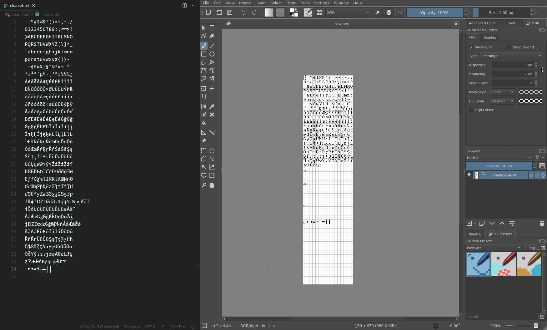
- You need to somehow organize all the glyphs you wish to make on the image. For the first few glyphs, this isn’t much of an issue, but as I added more and more glyphs, organization quickly got out of hand.
My own solution
As the downsides of Pixel Font Converter grew on me, in December 2021, I decided to try my hand at making my own piece of software for creating pixel fonts, which I called Online Pixel Font Creator.
My version would allow me to draw the glyphs directly in the browser with controls close to Krita’s, while also having the ability to preview the font in the same window, with live updates.
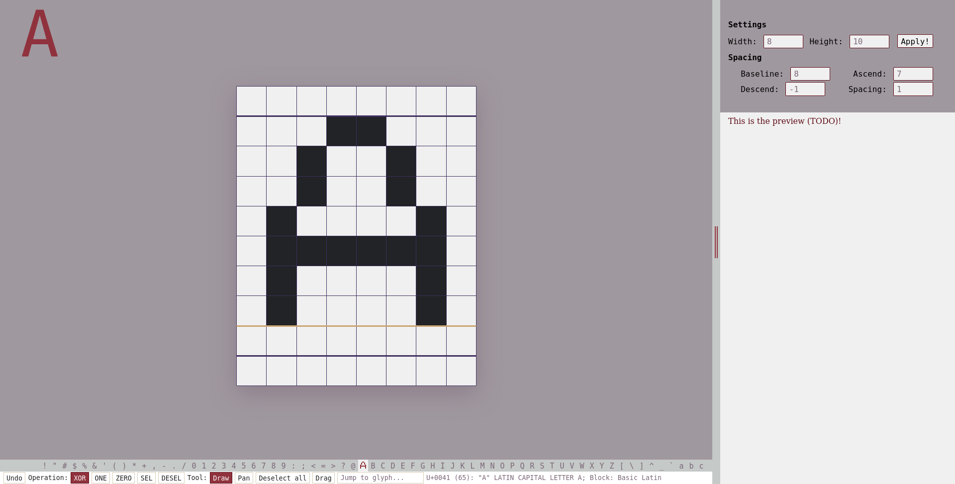 An early version of Online Pixel Font Creator, that still lacked the ability to preview or save fonts
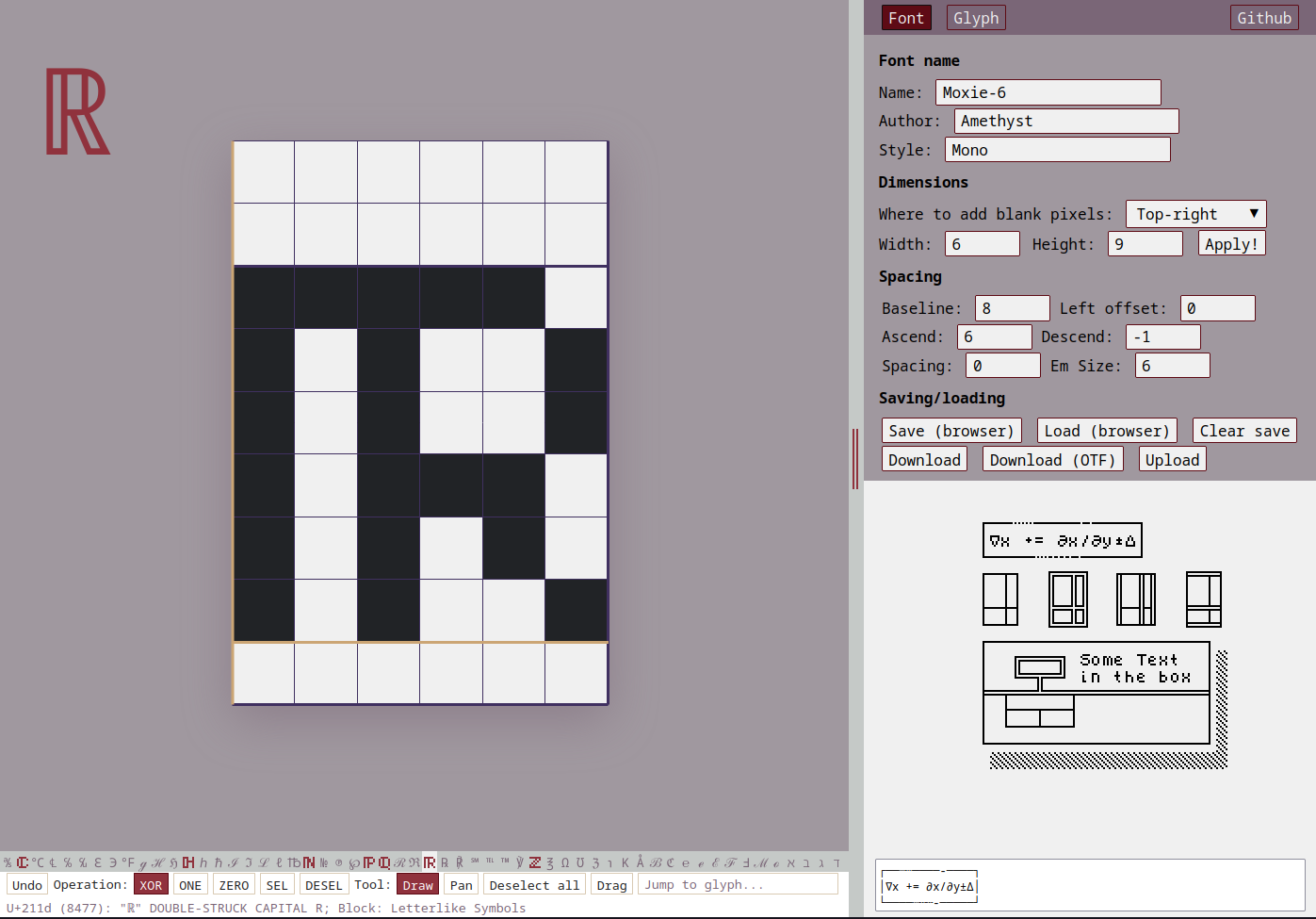 The current version of Online Pixel Font Creator, before the rewrite
The first version was entirely made in vanilla Javascript, with no library except opentype.js. This was mainly because I hadn’t yet tried any frontend framework, and the only one I had heard of as of yet — React — seemed like a bad fit for my application.
Funnily enough, though, I seem to have unknowingly implemented an equivalent to Solid.JS’s Stores, which allowed me then to automatically update the different pieces of the UI whenever I needed to.
Converting from bitmap to vectors
The format in my application is a bitmap format, which makes it very easy to edit the pixel fonts by just flipping the required bits.
TrueType fonts and OpenType fonts, however, commonly don’t use this format for describing their glyphs.
The glyf table, which is what opentype.js exposes, uses vector-based instructions, namely moveTo, lineTo, curveTo, quadTo and close.
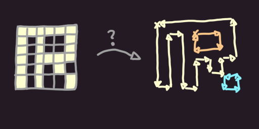 So, how does one convert from a bitmap image to a series of
 moveTo, lineTo and close instructions?
My solution involves 3 steps:
- Separate filled-in islands of pixels using a Von Neumann neighborhood (optional)
- For each island, find all the corners and annotate their winding direction
- Start with a random corner, and iteratively connect the corners
The first step can probably be ignored without compromising the rest of the algorithm, but it made it easier for me to program the second and third steps.
Finding corners
In this step, you simply need to iterate over a 2x2 window of all pixels of the image. For all 16 possibilities that can be encountered in the 2x2 window, there are 6 base cases, with the 10 other ones being rotations of these base cases:
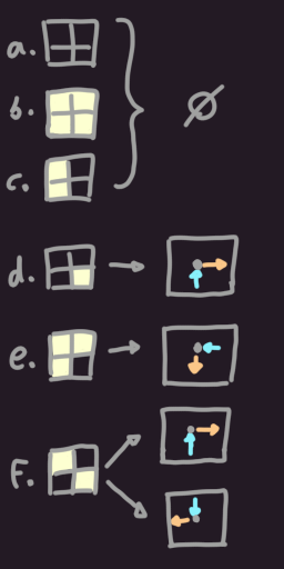
In cases a, b and c, nothing needs to be done, as those don’t contain corners.
In case d, you need to record a single corner with one of the sides of that corner becoming the input direction and one becoming the output direction.
It does not matter which winding direction you initially choose for d, as long as you stick with it for all of the rotations of d.
Case e should also have a single corner and it should respect the winding direction chosen for d.
This means that if you flip the bits of d, then you must swap the input direction with the output direction.
Case f is essentially a combination of two d cases (using the ∨ operator), and it should record two corners, keeping the winding direction.
You can also think of case f as a combination of two e cases (using the ∧ operator, this time).
Both ways of recording corners for cases d and f will work and will result in the same font visually,
although the underlying vector operations making up the final font will differ.
I chose to use a clockwise winding direction and to treat f as two e cases; I then store each corner as a 4-uple (x, y, dir_in, dir_out),
with (dir_in, dir_out) ∈ {0, 1, 2, 3}².
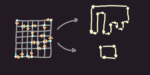
Once all of the picture has been analyzed, you can throw away the information about the pixels and only keep the information about the corners.
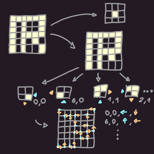
Connecting corners
For each corner, you can find the corner it connects to, by following the outward direction until you hit another corner whose input direction matches. This gives you a directed graph of corners, where cycles in the graph correspond to (inner and outer) loops of corners in the glyph.
So, to connect the corners together, you simply have to start with a random corner, then iteratively follow its outward direction to find the next corner, until you reach the corner you started with. If the shape has gaps, then you will have to repeat this process a few times, by starting with a random, unprocessed corner.
And that’s pretty much it!
All you then need to do is emit a series of moveTo, lineTo and close instructions for each loop.
The gaps in the shape will be handled by the TrueType algorithm and be rendered properly.
The metadata for the font
There are a few pieces of metadata that need to be saved alongside the glyphs, mainly:
- the “EM size”, which is what the
font-sizeproperty in CSS refers to. It used to refer to the width of the letter “M”, but nowadays it’s simply an unit defining the size of the font. - the “ascender size”, which tells the software using the font how high most glyphs may go above the baseline.
- the “descender size”, which tells the software how low most glyphs may go below the baseline.
- the “advance width” of each glyph, which tells the software how far it should place the next glyph.
- the “left side bearing” of each glyph, which tells the software where the glyph starts.
While the litterature claims that the EM size is conventionally a power of 2 or equal to 1000,
I haven’t yet encountered any issues with EM sizes that don’t respect this guideline.
I simply set the EM size to 128 * em_size_in_pixels, the ascender size to 128 * ascender_in_pixels and the descender size to 128 * descender_in_pixels
(assuming that descender_in_pixels is negative).
The “advance width” metadata is set to 128 * (glyph_width_in_pixels + global_spacing_in_pixels - glyph_left_offset_in_pixels).
The “left side bearing” metadata is only relevant for glyphs that have a glyph_left_offset > 0, in which case it is set to -128 * glyph_left_offset_in_pixels.
This allows the glyph to be rendered on top of the previous glyph.
Where is the documentation?
I wish I could find a good piece of litterature that describes all of these concepts properly. Finding information about font making has been a frustrating part of this journey, and I feel like it has been holding back my understanding of fonts.
So far, the main documentation is split between Apple’s and Microsoft’s equally awful documentation websites.
Fontforge provides some bits of helpful documentation, but it skips over things that their application automated away, which I end up having to figure out myself.
I still have open questions on this topic, like:
- How does one make a colored font?
- Is my solution correct? Will it be compatible with most software?
- How does one make ligatures, font features, etc.?
My fonts
The Warale Font
This was a font made for a multiplayer Dwarf Fortress game, called “Warale the Ageless Elder”. You can download it here!
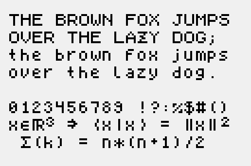
Shad’s Font
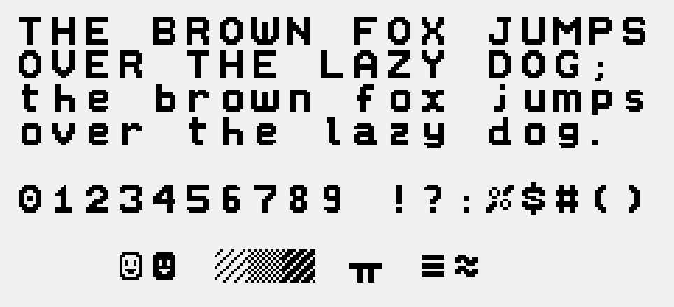
I haven’t yet found a better name for this font; it is the font used for the titles of this website.
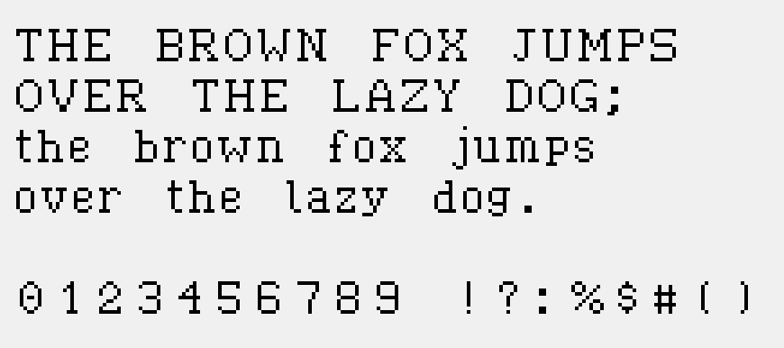
Stackline Classic
This is a font made for my Befunge-like programming language, stackline.
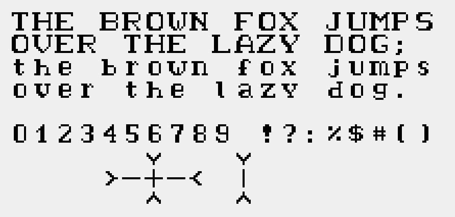
Moxie-6 Mono
This is a small 6x6 font, which renders well when scaled by a factor of 2. You can choose to view this page with this font by clicking the “pixel” option in the font toggle at the top of this page.